As guests shop for the perfect item, the number of options can be overwhelming. It's important to give guests clear, concise filters to help narrow that search down. Several enhancements were made to the filter experience, here are a few.
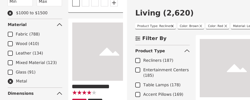
In our previous design (left), selected filters appeared within their respective category, which meant scrolling to interact with them. A "breadbox" treatment keeps all selected filters in one place instead (right).
Previously, closing a selected filter would also shift the content below it up, changing the interface under the guest's cursor. That moment of "wait, where did it go" is never a good thing, the new design avoids it entirely.
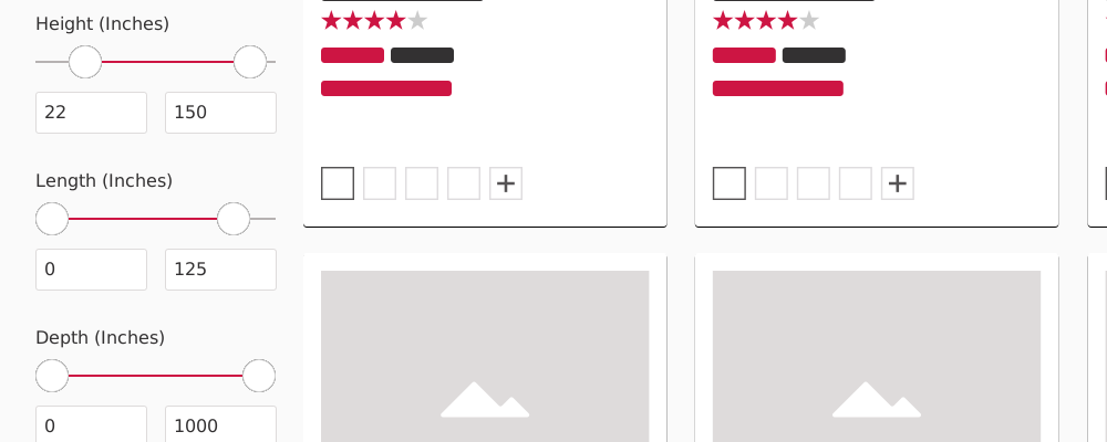
We wanted more functionality within the dimension filter. Usability testing showed guests were having a difficult time with the existing UI, so we added slide functionality that's noticeably easier to use, particularly on mobile devices.
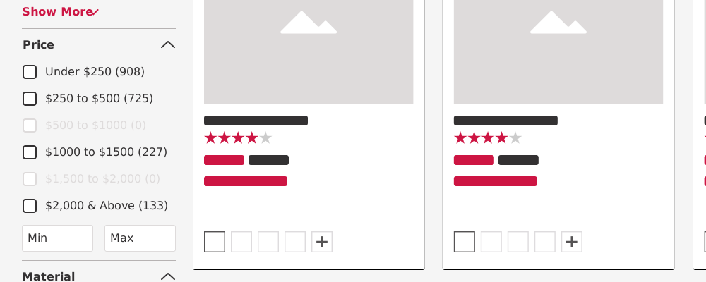
Previously, a filter with zero matching results simply didn't appear in the interface. There's real research on why that creates a frustrating experience, so we corrected it, filters with zero results now appear "greyed out" instead of disappearing.